What Type of Cosmetic Product Are You Packaging?
This is the first question and most packaging websites skip it entirely. They throw a generic page at you and hope you figure it out yourself.
Different cosmetic products need different packaging approaches. A lipstick box and a skincare serum box aren’t even in the same conversation. Here’s how we break it down:
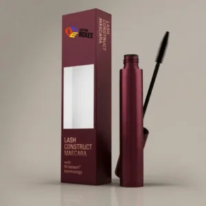
Lipstick & Lip Gloss Boxes
- Typical size: 1″ x 1″ x 3.5″ to 1.5″ x 1.5″ x 5″
- Best material: 350-400 GSM cardboard
- Recommended finish: Matte lamination with spot UV on logo gives that high-end cosmetic counter feel
- Key consideration: These boxes need to stand upright on shelves. Tuck-end closures work best. Bottom needs to be sturdy enough to prevent tipping.
Foundation & Concealer Boxes
- Typical size: 2″ x 2″ x 4″ to 3″ x 3″ x 5″ (varies by bottle shape)
- Best material: 400 GSM cardboard for standard, rigid board for premium lines
- Recommended finish: Soft-touch lamination customers associate that velvety feel with luxury foundations
- Key consideration: If your foundation comes in a glass bottle, you need a snug fit or a custom insert. A bottle rattling inside a box feels cheap no matter how pretty the outside is.
Skincare Boxes (Serums, Moisturizers, Cleansers)
- Typical size: Varies widely measure your container and add 2-3mm clearance on each side
- Best material: 350 GSM cardboard for everyday skincare, kraft for “clean beauty” positioning, rigid for luxury/anti-aging lines
- Recommended finish: Depends on brand positioning. Clinical brands → matte + clean typography. Luxury brands → foil stamping + embossing. Natural brands → kraft + minimal single-color print.
- Key consideration: Skincare boxes need room for ingredient lists, directions, and sometimes regulatory information. Plan your panel layout before finalizing dimensions.
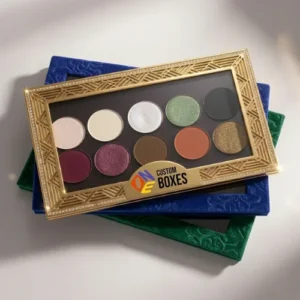
Eyeshadow & Makeup Palette Boxes
- Typical size: Custom palettes come in too many shapes to standardize
- Best material: Rigid board with magnetic closure for premium palettes. 400 GSM cardboard for everyday palettes.
- Recommended finish: Full-color printing with high-gloss or spot UV. Palettes are visual products the box should be equally visual.
- Key consideration: Palettes are flat and wide, which means they’re vulnerable to bending during shipping. Rigid board solves this. If using cardboard, go with a higher GSM.
Perfume & Fragrance Boxes
- Typical size: Custom to bottle dimensions
- Best material: Rigid board non-negotiable for fragrance. The weight and structure of a rigid box communicates luxury before the customer even smells anything.
- Recommended finish: Foil stamping + embossing on rigid board is the industry standard for fragrance packaging. Soft-touch lamination as base. Interior printing for full brand experience.
- Key consideration: Custom foam or cardboard inserts to cradle the bottle. Fragrance bottles are heavy, glass, and oddly shaped. Without a proper insert, they’ll shift and potentially break.
Nail Polish Boxes
- Typical size: 1.5″ x 1.5″ x 4″ approximately
- Best material: 350 GSM cardboard
- Recommended finish: Window cutout to show the actual polish color this is one product where seeing is believing. Gloss lamination to complement the glossy nature of the product.
- Key consideration: Nail polish bottles are glass and filled with liquid. Snug fit is essential. Consider a small insert or partition if packaging multiple bottles together.
Subscription & Gift Set Boxes
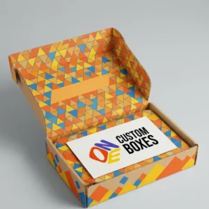
- Typical size: Larger format typically mailer style or two-piece rigid
- Best material: Corrugated mailer for subscription (needs to survive shipping). Rigid two-piece for gift sets (needs to feel premium on the shelf).
- Recommended finish: Interior printing is huge here. The outside gets them to open it. The inside creates the “wow” moment. Full-color interior printing with a branded tissue paper layer is the gold standard.
- Key consideration: These boxes carry multiple products, so weight adds up fast. Make sure your material choice can handle the combined weight without sagging or crushing.
Material Comparison: Which One Is Right for Your Cosmetic Brand?
This is probably the most important decision you’ll make and the one with the least guidance available online. So here’s a straightforward comparison:
| Feature |
Cardboard (SBS) |
Kraft |
Rigid Board |
Corrugated |
| Best for |
Retail cosmetic boxes |
Natural/organic brands |
Luxury/premium lines |
Shipping & mailers |
| Thickness |
300-450 GSM |
300-400 GSM |
1000-2000 GSM |
Varies by wall type |
| Print quality |
Excellent smooth surface takes ink beautifully |
Good but natural brown color affects color output |
Excellent wrapped in printable paper |
Good slightly textured surface |
| Feel in hand |
Light to medium weight |
Light, natural texture |
Heavy, substantial, premium |
Light but sturdy |
| Durability |
Moderate |
Moderate |
Very high |
High |
| Cost |
$$ |
$ |
$$$$ |
$$ |
| Eco-friendliness |
Recyclable |
Recyclable + biodegradable |
Recyclable (varies by components) |
Highly recyclable |
| Brand positioning |
Mid-range to premium |
Natural, organic, clean |
Luxury, high-end |
Not typically customer-facing |
Quick Decision Guide:
- Selling at Sephora/Ulta price points? → Rigid board or high-GSM cardboard with premium finishes
- Selling a clean/organic beauty line? → Kraft with minimal printing
- Selling mid-range cosmetics online? → 350-400 GSM cardboard with matte or gloss lamination
- Selling luxury fragrance or skincare? → Rigid board, no question
- Need shipping boxes for e-commerce orders? → Corrugated mailer with branded printing
Print Finishes Explained What Actually Matters vs. What’s Just Extra
Every packaging company lists the same finishes matte, gloss, spot UV, foil stamping, embossing. But nobody tells you WHEN each one makes sense and when you’re just adding cost for no real return.
Here’s the honest breakdown:
Matte Lamination
What it does: Smooth, non-shiny surface with a subtle, sophisticated feel.
When to use it: Premium skincare, minimalist branding, clinical/dermatological positioning. Matte says “we’re serious about our product, not just flashy.”
When to skip it: If your brand is playful, bold, or color-heavy. Matte can dull vibrant colors slightly.
Gloss Lamination
What it does: Shiny, reflective surface that makes colors pop.
When to use it: Bold, colorful cosmetic brands. Nail polish boxes. Playful, youthful brand identities. Products that rely on vibrant visuals to attract attention.
When to skip it: Luxury positioning. Gloss can feel “cheap” on high-end products sounds counterintuitive, but it’s true in the cosmetics world.
Soft-Touch Lamination
What it does: Velvety, almost suede-like texture. People literally can’t stop touching it.
When to use it: Anytime you want the box to feel expensive. This single finish can elevate a $2 box to a $10 perceived value. It’s the most effective “luxury signal” in packaging.
When to skip it: Very tight budgets. It’s the most expensive lamination option. Also not ideal for boxes that will be handled extensively in wet environments (bathroom products) it can show fingerprints and water spots.
Spot UV Coating
What it does: Applies glossy coating to specific areas (usually logos or design elements) while the rest of the box stays matte. Creates visual contrast.
When to use it: When you want your logo or brand name to literally shine. The contrast between matte background and glossy logo is eye-catching without being over the top.
When to skip it: If your design is very busy or complex. Spot UV works best with clean, simple designs where the contrast is immediately noticeable.
Foil Stamping (Gold, Silver, Rose Gold, Holographic)
What it does: Metallic foil applied to specific areas using heat and pressure. Creates a genuine metallic shine that printing alone can’t replicate.
When to use it: Luxury cosmetics, perfume boxes, premium skincare. Gold foil on a dark box is probably the most universally recognized “luxury packaging” signal in the beauty industry. Rose gold foil is trending heavily for feminine beauty brands.
When to skip it: Mass-market, value-oriented products where the foil cost doesn’t align with the price point.
Embossing / Debossing
What it does: Raises (embossing) or presses (debossing) specific areas of the box to create a 3D texture.
When to use it: Logos, brand names, or patterns where you want a tactile element. Combined with foil stamping, it’s the ultimate luxury finish. Also great as a standalone on kraft boxes debossed logo on brown kraft is simple but stunning.
When to skip it: Very small text or intricate details they don’t emboss well. Best for logos, icons, and larger type.
7 Cosmetic Packaging Mistakes That Are Costing You Sales
Nobody talks about this. Every packaging website tells you what TO do. Here’s what NOT to do based on what we’ve seen working with thousands of beauty brands:
1. Choosing Material Based on Price Alone
The cheapest box isn’t saving you money if it makes your $40 serum look like a $12 impulse buy. Material choice should be driven by brand positioning, not just budget.
2. Ignoring the Inside of the Box
The exterior gets someone to open it. The interior determines how they feel about it. An all-white, blank interior is a missed opportunity. Even a single brand color or a small “thank you” message printed inside changes the unboxing experience dramatically.
3. Overcrowding the Design
More isn’t more. When every surface of your box is covered in text, graphics, patterns, and icons nothing stands out. The best cosmetic packaging has breathing room. White space is your friend.
4. Wrong Size Box
A product swimming inside an oversized box feels like the company doesn’t pay attention to details. A product jammed into a too-tight box feels cheap and frustrating to open. Size your box to your product 2-3mm clearance on each side.
5. Inconsistent Packaging Across Product Line
If your moisturizer box is matte black with gold foil but your cleanser box is glossy white with blue text your brand looks disjointed. Customers should be able to identify your products as belonging together even from a distance. Create a packaging system, not individual boxes.
6. Skipping Structural Testing
A box that looks perfect in a digital mockup might not hold up in real life. Paper stock might be too thin. The closure might not stay shut. The box might warp in humidity. Always order a physical sample before committing to a full production run.
7. Forgetting FDA Cosmetic Labeling Requirements
In the US, cosmetic products have specific labeling requirements set by the FDA:
- Product identity (what it is)
- Net quantity of contents
- Name and place of business of manufacturer, packer, or distributor
- Ingredient list in descending order of predominance
- Any required warnings
Missing required information doesn’t just look unprofessional it can result in regulatory action. Make sure your packaging design accounts for all required label elements.
2024-2025 Cosmetic Packaging Trends Worth Knowing
The beauty packaging world moves fast. Here’s what’s actually trending not just what looks good on Pinterest, but what’s driving purchasing behavior:
Minimalism Is Winning
Clean lines. Limited color palettes. Lots of white space. Typography-driven designs. Brands like The Ordinary proved that stripping away the visual noise doesn’t make you look “cheap” it makes you look confident. Minimalist cosmetic boxes with one accent finish (a single foil-stamped logo, for example) are outperforming busy, multi-color designs.
Sustainable Packaging Is Expected, Not Bonus
Two years ago, eco-friendly packaging was a differentiator. Now it’s baseline. Consumers especially Gen Z and Millennial beauty buyers expect recyclable materials and responsible printing as standard. Brands still using non-recyclable packaging are starting to face backlash.
Soft-Touch Everything
The soft-touch finish has taken over premium cosmetic packaging. That velvet-like feel creates an immediate emotional response. Customers associate it with luxury, quality, and care. If you’re selling anything above the drugstore price point, soft-touch lamination should be on your radar.
Refillable Packaging Models
Not just a trend a movement. Brands offering refillable cosmetic containers with outer packaging designed to be kept and reused are gaining serious traction. Your primary box becomes a permanent brand touchpoint in the customer’s home. Something to consider for your packaging strategy.
Monochrome + Metallic
Single-color box with one metallic accent. All black with silver foil. All white with gold foil. All navy with rose gold foil. This combination dominates the premium beauty space right now because it’s striking, elegant, and photographs beautifully for e-commerce and social media.
Transparent/Window Packaging
Letting the product speak for itself. Die-cut windows that show the actual product color, texture, or design are increasingly popular especially for lipsticks, nail polishes, and cream products where color is a purchasing factor.
What Affects the Cost of Custom Cosmetic Boxes?
Nobody in our industry talks about pricing openly. Every website says “affordable” or “competitive rates” but nobody explains what actually drives cost. Here’s the transparent breakdown:
| Factor |
How It Affects Price |
| Material type |
Kraft is cheapest. Cardboard is mid-range. Rigid is most expensive. |
| Material thickness (GSM) |
Higher GSM = more material = higher cost per box |
| Box size |
Larger boxes use more material. Simple math. |
| Print colors |
Full-color CMYK is standard pricing. Pantone matching adds slightly. |
| Finishing |
Basic lamination is affordable. Foil stamping, spot UV, embossing each add cost. Stacking multiple finishes increases price significantly. |
| Quantity |
Higher quantities = lower per-unit cost. Significantly. A box that costs $3.00 at 100 units might cost $0.80 at 5,000 units. |
| Custom inserts |
Foam inserts, cardboard dividers, or custom-molded trays add cost but add perceived value. |
| Structural complexity |
Standard tuck-end boxes are cheapest. Magnetic closures, drawer-style, sleeve boxes cost more due to additional assembly. |
| Interior printing |
Printing inside the box (full-color interior) adds cost but creates a dramatically better unboxing experience. |
Rough Price Ranges (For Reference Only Get Actual Quote for Accuracy):
- Basic cardboard cosmetic box (no finish): $0.35 – $0.85 per unit at 1,000+ quantity
- Cardboard with matte lamination + spot UV: $0.65 – $1.50 per unit at 1,000+ quantity
- Cardboard with foil stamping + soft-touch: $1.00 – $2.50 per unit at 1,000+ quantity
- Rigid box with magnetic closure: $3.00 – $8.00+ per unit at 1,000+ quantity
- Kraft box with single-color print: $0.25 – $0.60 per unit at 1,000+ quantity
These are ballpark figures. Actual pricing depends on your specific dimensions, design, and order quantity. Get a free custom quote for accurate pricing.
Ready to Get Started?
You’ve done the research. You understand your options. You know what material fits your product, what finishes align with your brand, and what pitfalls to avoid.
Now it’s just about making it happen.
Here’s how:
- Tell us what you need product type, approximate size, quantity, and any design preferences
- Get a free quote and 3D mockup see your box before you commit
- Approve the design make changes until it’s exactly right
- We produce and ship 8-10 business days, free shipping in the USA
No minimums. No hidden fees. No generic templates. Just custom cosmetic packaging built specifically for your brand.
Get your free quote now.