Boost Your Brand with our Custom Packaging!
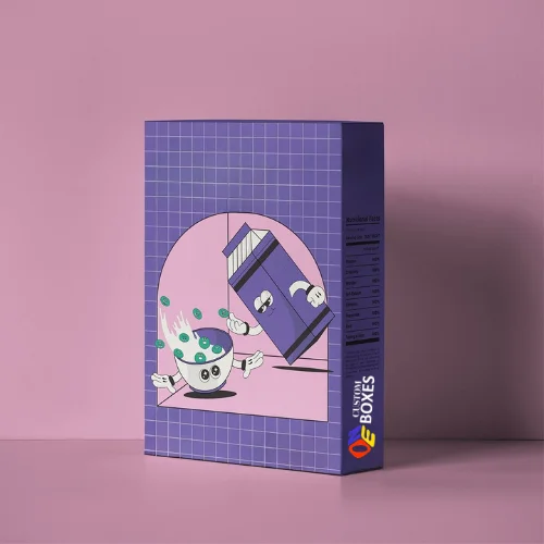
Custom cereal boxes are food-grade folding cartons made from SBS paperboard or kraft board with a food-safe inner liner. They protect cereal from moisture and contamination, display nutritional and regulatory information, and carry full brand identity through custom printing and premium finishes. They are available in multiple sizes and structural styles for retail, e-commerce, private label, and specialty food applications.
A cereal box has six surfaces. Most brands design one the front panel and treat the rest as compliance space. The brands consistently winning retail placement and repeat purchases design all six as brand real estate. The front wins first attention.

Get Your Custom Boxes Designed in Your Desired Shape, Size and Style

Get Your Custom Boxes Designed in Your Desired Shape, Size and Style

Get Your Custom Boxes Designed in Your Desired Shape, Size and Style
| Dimensions | All Custom Sizes & Shapes |
|---|---|
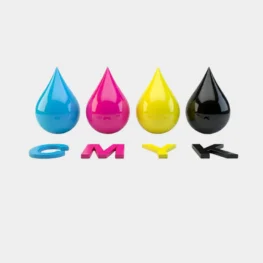
| Printing | CMYK, PMS, No Printing |
| Paper Stock | 10pt to 28pt (60lb to 400lb) Eco-Friendly Kraft, E-flute Corrugated, Bux Board, Cardstock |
| Quantities | 100 - 500,000 |
| Coating | Gloss, Matte, Spot UV |
| Default Process | Die Cutting, Gluing, Scoring, Perforation |
| Options | Custom Window Cut Out, Gold/Silver Foiling, Embossing, Raised Ink, PVC Sheet |
| Proof | Flat View, 3D Mock-up, Physical Sampling (On request) |
| Turn Around Time | 4–6 Business Days, Rush |
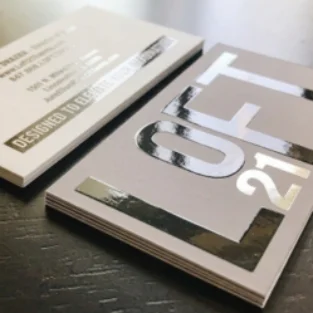
It is a popular choice for luxury and high-end product packaging. This coating delivers a silky, soft-touch texture, which adds a refined appearance and leaves a lasting impression of quality and exclusivity
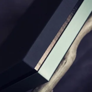
It is a popular choice for luxury packaging and corporate branding. This finishing method presses the design into the material, which creates an elegant dimensional effect and gives the packaging a refined, professional look.
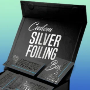
It is a popular choice for upscale product packaging and branding. This technique adds a reflective silver foil effect, which highlights important details and gives the packaging a sophisticated and eye-catching look.
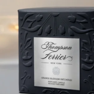
It is commonly used by brands looking to create a premium and tactile packaging experience. This technique raises selected design elements above the surface, which adds depth, texture, and a distinctive visual appeal to the packaging.

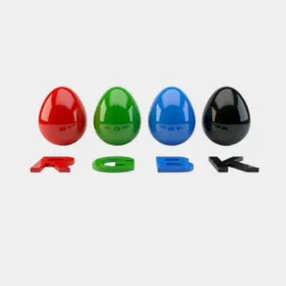
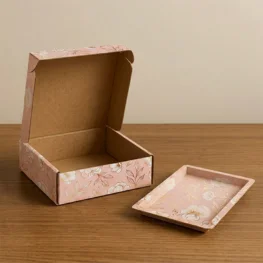
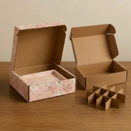
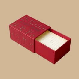
Stand in the cereal aisle for sixty seconds and just watch. Shoppers don’t read first. They scan. Their eyes move across dozens of boxes in seconds processing color, contrast, and visual weight before any conscious decision happens. The box that breaks that scan wins the sale. The box that blends in doesn’t.
Custom cereal boxes are the most strategically important packaging decision a breakfast food brand makes. Not because the format is complicated it isn’t. But because the cereal shelf is one of the most visually competitive retail environments in grocery, and every brand on that shelf has invested in making their box work harder than the one next to it.
According to the Paper and Packaging Board, 72% of purchase decisions at the point of sale are directly influenced by packaging design. In a category where the product can’t be tasted, smelled, or sampled before purchase, that number defines the entire commercial argument for getting cereal packaging right.
Packaging providers like One Custom Boxes work with food brands specifically on this challenge translating brand strategy into shelf-ready packaging that performs in the real retail world, not just in a design presentation.
Custom cereal boxes are food-grade folding cartons made from SBS paperboard or kraft board with a food-safe inner liner. They protect cereal from moisture and contamination, display nutritional and regulatory information, and carry full brand identity through custom printing and premium finishes. They are available in multiple sizes and structural styles for retail, e-commerce, private label, and specialty food applications.
That’s the functional definition. But here’s what actually matters in practice.
A cereal box has six surfaces. Most brands design one the front panel and treat the rest as compliance space. The brands consistently winning retail placement and repeat purchases design all six as brand real estate. The front wins first attention. The back closes the purchase decision when the shopper flips the box for a closer look. The sides tell the brand story for shoppers who linger.
Here’s what separates a well-specified custom cereal box from generic food packaging box :
Here’s a situation that plays out constantly in the food startup space and it illustrates the packaging stakes better than any abstract argument.
A health food entrepreneur spent two years developing a genuinely differentiated high-protein granola. Superior macronutrient profile. Cleaner ingredient list than anything in their price tier. Blind taste tests consistently outperformed competitors. They launched direct-to-consumer with strong early results, then approached a regional grocery chain about shelf placement.
Their packaging was a standard kraft box with a printed label applied. It worked online where brand photography and copy carried the story. On a retail shelf next to brands with professionally designed, direct-printed boxes, it looked like a home-packaged product.
They invested in custom printed cereal boxes proper offset printing on SBS board, matte finish, spot UV logo, a nutritional panel designed as part of the layout rather than bolted on afterward. The same grocery chain approved them in the next review cycle. Within eight months they were in fourteen store locations.
Research published in the Journal of Consumer Psychology found that shoppers make visual product selections in as little as 3–5 seconds of passive shelf scanning before conscious evaluation begins. Color contrast, visual weight, and typographic hierarchy are processed in this window. Claims, ingredients, and brand names come later.
This means custom cereal box design must win two separate battles. First: the visual scan that happens from two meters away. Second: the purchase confirmation that happens when the shopper picks the box up and reads it. Most brands design for the second battle and lose the first.
Retail branding consultants working in FMCG consistently report that cereal packaging designed with explicit shelf-context testing viewing the design surrounded by actual competitor packaging rather than in isolation outperforms designs created without that context in first-purchase conversion by significant margins. The box that looks exceptional in a design deck can disappear entirely on the actual shelf.
Before a customer ever sees a cereal on shelf, a retail buyer has already made a judgment about whether it belongs there. Buyers evaluate hundreds of products. Their first filter is always visual: does this packaging look like it belongs on our shelf next to the brands our customers already trust?
Professional custom cereal packaging with direct printing, premium finishes, and properly integrated compliance panels passes that filter. Label-applied or generic packaging rarely does regardless of what’s inside.
Retail buyers across major grocery chains consistently cite packaging professionalism as a primary evaluation criterion for new food product listings often before price point, margin structure, or product differentiation enters the conversation.
The dominant format in retail cereal for over a century and still dominant because it genuinely works. Tall, narrow, rectangular, with the largest uninterrupted front panel in the format category. Cost-efficient at scale, assembles quickly on production lines, stacks flat for storage efficiency. For high-volume brands managing tight margins, straight-tuck cereal boxes deliver the best combination of production economics and retail presence.
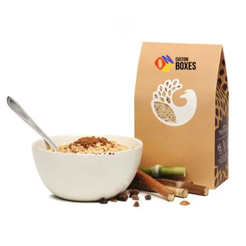
The peaked gable top creates instant visual differentiation on shelves where rectangular formats dominate. Works particularly well for artisan granola, premium muesli, and specialty breakfast products where the structural format communicates craft quality before the customer reads anything. The peaked top also functions as a natural carry handle a practical detail that registers positively in the in-store experience.
Die-cut window patches let customers see the product before purchase building confidence for cereals with strong visual appeal. Granolas with visible fruit and nut pieces, colorful puffed cereals, and distinctive cluster formats all benefit from window cereal packaging that communicates product quality through transparency rather than claims.
Kraft cereal boxes have become the visual shorthand for natural, organic, and clean-label breakfast positioning. The uncoated brown texture communicates honest ingredients and minimal processing in a way that bleached white board packaging simply can’t convey regardless of what the label says. For organic granola brands, whole grain cereal companies, and any breakfast product where the ingredient story is the primary selling argument, kraft creates immediate visual alignment between product and packaging.
Family size and club store formats require additional board weight for structural integrity and sometimes integrated handle construction for consumer convenience. They also offer the largest brand canvas in the cereal category more surface area for secondary messaging, promotional content, and brand storytelling that standard retail formats can’t accommodate.
Eco-Friendly Cereal Boxes
Eco-friendly cereal packaging from FSC-certified paperboard, recycled content board, and plastic-free inner liners is one of the fastest-growing segments in food packaging. According to Nielsen’s Global Sustainability Report, 73% of global consumers factor environmental packaging into purchasing decisions. In the natural and health food cereal segment where the consumer demographic is particularly environmentally aware sustainable packaging is increasingly a purchase prerequisite, not just a differentiator.
Sustainability Note: FSC-certified and recycled content cereal boxes are available with full-color offset printing and premium finish options sustainable credentials without any compromise on shelf impact or brand presentation quality.
Cereal box customization operates at two levels that must work together: functional specification that protects the product and meets compliance requirements, and brand specification that drives shelf performance and purchase decisions.
| Feature | Primary Benefit | Best Application |
|---|---|---|
| SBS paperboard | Maximum print brightness and color fidelity | Mass market and premium retail cereal |
| Recycled content board | Sustainability credentials with maintained print quality | Eco-conscious and natural cereal brands |
| Food-grade inner liner | Moisture barrier, freshness protection, food safety | All cereal packaging applications |
| Offset printing | Accurate brand color at production scale | All retail cereal packaging |
| Matte lamination | Premium tactile quality, strong photography performance | Artisan granola and premium health cereals |
| Gloss lamination | Vivid color, high-visibility shelf impact | Children’s cereals, mass market brands |
| Spot UV | Logo and brand mark emphasis on matte surfaces | Premium and natural cereal positioning |
| Embossed brand marks | Tactile premium quality signal | Luxury and artisan cereal brands |
| Die-cut window patches | Product visibility, purchase confidence | Granola, clusters, visually distinctive cereals |
| Resealable closure strips | Freshness and consumer convenience | Premium and health food cereal brands |
| Regulatory compliance panel | Legal requirement and consumer trust | All cereal markets and jurisdictions |
| QR code integration | Digital brand connection, loyalty programs | DTC and premium grocery cereal brands |
Tip: Matte lamination combined with spot UV on key brand elements creates a premium shelf presence that photographs well for both retail buyer submissions and brand social media content a dual return on a single finish investment.
The cereal box specification involves more decisions than most food brands account for in initial planning. Here’s what actually matters:
The cereal aisle hasn’t changed its fundamental format in over a century not because packaging innovation stopped, but because the folding carton format keeps earning its place. It stacks efficiently. It presents a large brand canvas. It pours cleanly. It holds structural integrity through the retail journey and the home storage lifecycle.
What changes what separates cereal brands that win shelf space from those that disappear into the visual noise is everything that happens within that format. The color strategy. The typographic hierarchy. The finish that makes the box feel considered before a single word is read. The compliance panel that communicates transparency. The inner liner that delivers on the freshness the brand has promised.
Custom cereal boxes are where all of those decisions become physical a package that either earns its place on the shelf or quietly gets replaced at the next range review.
The breakfast brands building lasting retail positions are the ones treating packaging as a strategic asset. They design for shelf context, not design presentations. They choose materials that support the brand position they’re actually building. They integrate compliance from the start. And they understand that in the cereal aisle, the best product doesn’t always win the best packaged product does.
One Custom Boxes works with food brands across every stage of the cereal packaging process from first custom runs at launch volumes through large-scale retail supply programs bringing food category packaging expertise to decisions that directly determine whether a product earns the shelf space its quality deserves.
The best material depends on your brand positioning and budget. Rigid chipboard is ideal for luxury wig packaging because it’s durable and premium in feel. Standard cardboard wig boxes work well for retail and everyday use they’re lightweight and easily customizable. For eco-conscious brands, kraft paper offers excellent eco-friendly wig box options that resonate with sustainability-minded customers. The key is to match the material to your customer’s expectations and the shipping demands of your product.
Yes, many custom wig boxes are made from sustainable packaging solutions, including recycled cardboard, FSC-certified paper, and soy-based inks. When working with a packaging provider, simply request eco-friendly wig boxes. The environmental footprint of your hair product packaging is increasingly important to consumers, and choosing recyclable or biodegradable materials can actually strengthen your brand image.
Custom-printed wig boxes give you complete control over how your brand looks at the point of sale. Your logo, color palette, typography, and visual story all appear on the box making it a walking advertisement for your brand. In real-world retail, branded hair packaging increases recognition and builds trust. Online, it creates the kind of polished product display packaging that encourages customers to share unboxing experiences, driving organic social media visibility.
In most cases, yes. Wigs are delicate and can shift, tangle, or lose shape during transit or storage. Custom inserts foam, cardboard, or fabric hold the wig securely in place inside the box and help maintain its original form. For premium hair extension packaging especially, inserts are a strong signal of quality and care that customers notice immediately upon opening.
Minimum order quantities (MOQs) vary depending on the type of custom wig box, the printing method, and the supplier. For standard cardboard wig boxes with digital printing, MOQs can be as low as 50–100 units. Wholesale wig boxes with offset printing usually start from 500 units and above. Rigid boxes and luxury wig packaging tend to have slightly higher MOQs due to the production process involved. It’s always worth discussing your volume needs upfront to find the most cost-effective option for your business.