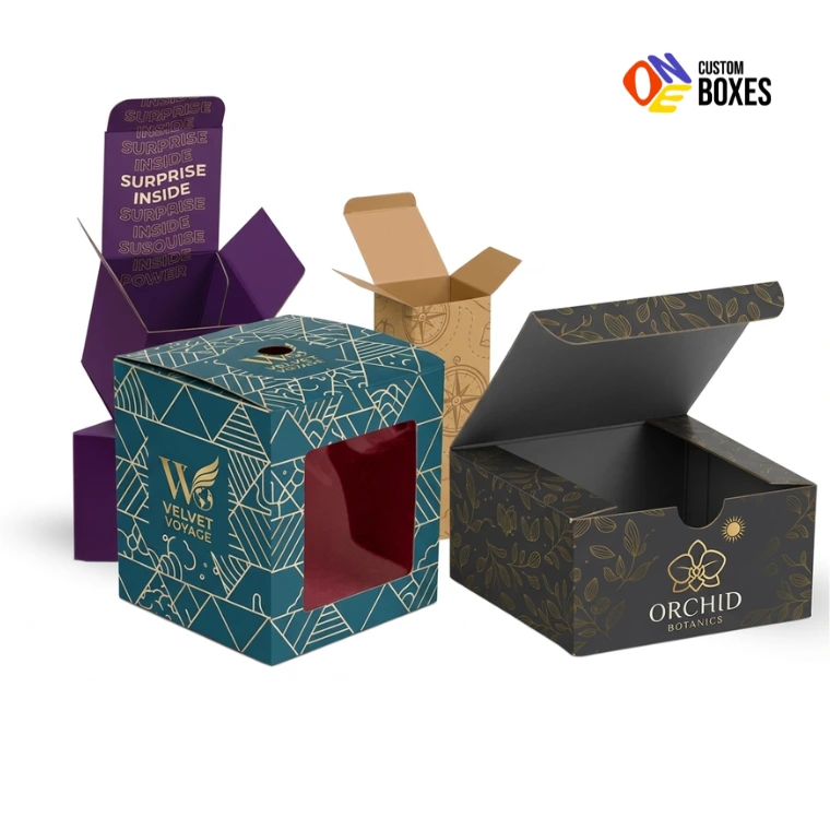
Boost Your Brand with our Custom Packaging!
You’re here because you sell a product at retail and your packaging isn’t performing. Maybe your product is great but it gets overlooked on the shelf next to competitors with sharper, more professional-looking boxes. Maybe you’re launching a new product into retail for the first time and you need packaging that belongs next to established brands. Maybe a retailer told you your current packaging doesn’t meet their standards. Maybe you’re rebranding and everything needs to look and feel different starting with the box.
5,000+ brands big and small 🥰 love us! ★ ★ ★ ★ ★ 5.0 Google Reviews
Whatever brought you here, there’s a reality about retail that most product companies learn the hard way: your packaging is your most important salesperson. Not your social media. Not your advertising. Not your ingredient list. The box. Because in a retail environment, the box is the first and often the only thing a customer interacts with before making a purchase decision.
And that decision happens fast. Studies consistently show that shoppers spend 3 to 7 seconds evaluating a product on a shelf before either picking it up or moving on. Seven seconds. In that window, your packaging has to grab attention, communicate what the product is, establish credibility, and give someone a reason to reach for it instead of the 15 other options sitting within arm’s reach.
This page walks you through everything that goes into retail packaging that actually performs on shelf. Box structures, materials, printing, finishing, sizing, shelf strategy, retailer requirements, cost factors, and the mistakes that cost brands shelf placement and sales every single day. Practical, specific, actionable information. Not marketing talk.
Let’s get into it.
Retail packaging isn’t one-size-fits-all. A product going into Walmart has completely different packaging requirements than a product going into a boutique shop on Main Street. Before talking about box types and materials, you need to understand the retail environment your packaging will live in.
The most demanding retail environment. Strict packaging specifications. Planogram compliance (your box must fit the exact shelf space allocated by the store’s layout system). Shelf-ready packaging requirements. Barcode placement standards. Minimum durability requirements for supply chain handling. And the most competitive visual environment imaginable: thousands of SKUs fighting for attention under fluorescent lighting.
Packaging priorities: Shelf-ready compatibility, planogram compliance, maximum visual impact in minimal space, durability through supply chain handling, barcode and labeling standards
Smaller stores with curated product selections. Less strict specifications but higher aesthetic expectations. The store environment is designed to feel premium, and your packaging needs to match that energy. Products often displayed individually or in small groupings, not in packed shelf rows.
Packaging priorities: Premium materials and finishes, brand storytelling on the box, unique structural designs that stand out in a curated setting, tactile quality
Products sold online but the interior box (inside the shipping box) needs to look retail-ready. The customer opens the shipping box and finds a branded product box inside that looks like it came from a store shelf. This is the standard expectation for direct-to-consumer brands in 2024.
Packaging priorities: Structural integrity to survive shipping inside a mailer, premium unboxing experience, visual and tactile quality comparable to in-store retail packaging
Farmers markets, craft fairs, holiday pop-up shops, trade shows. Packaging needs to look professional but cost structures are different. Quantities are smaller. Flexibility is more important than mass-production efficiency.
Packaging priorities: Professional appearance at low minimum quantities, quick turnaround, cost-effective materials that still look intentional and branded
Unique packaging requirements. Products often sold in multi-packs or larger formats. Packaging must function as both shipping container and display. Members shop in a warehouse environment, so packaging needs to be visible from further distances than standard retail aisles. Often requires specific packaging configurations (e.g., Costco’s “Kirkland ready” display pallet requirements).
Packaging priorities: Multi-pack configurations, dual-function packaging (shipping + display), large-format visibility, club-specific compliance standards
The most common retail box structure. Both the top and bottom flaps tuck in the same direction (toward the back of the box). Simple, cost-effective, and universally used across almost every product category.
How It Works: Flat cardboard sheet is die-cut, scored, folded, and glued into a tube shape. Top and bottom flaps fold in and tuck closed. The box sits on the retail shelf with the front panel facing the customer.
Typical Applications: Cosmetics, supplements, food products, pharmaceuticals, small electronics, household items, personal care products
Sizes Available: Virtually unlimited. Custom-sized to your exact product dimensions.
Material: 300-450 GSM SBS cardboard (most common for retail). Kraft for natural/organic positioning.
Pros: Lowest manufacturing cost of any retail box. Fastest production. Ships flat for efficient storage. Universal, professional appearance that works across all product categories. Compatible with automated packaging lines.
Cons: Both tuck flaps are on the same side, which means one side has visible tuck flap edges (usually hidden at the back on shelf). No premium “opening experience” since tucks just fold in and out.
Best For: Products where cost efficiency and shelf presence matter more than unboxing experience. Mass retail products. Products packaged in high volume on automated lines.
Similar to straight tuck end, but the top flap tucks in one direction and the bottom flap tucks in the opposite direction. This creates a cleaner appearance because the closure flap edges are distributed between front and back.
How It Works: Same flat-sheet construction as STE, but the tuck directions alternate. When standing on shelf, the top closure tucks toward the front and the bottom tucks toward the back (or vice versa).
Typical Applications: Same as STE, but often preferred when the product will be handled and examined closely (cosmetics, premium personal care, supplements)
Pros: Slightly cleaner overall appearance than STE because tuck edges aren’t all on one side. Same cost-effective manufacturing as STE. Same flat-shipping efficiency.
Cons: Minimal visual difference from STE when on shelf. Same basic opening experience.
Best For: Products where you want the slight aesthetic improvement over STE without adding cost. Personal care, cosmetics, health products, specialty food.
Boxes with a bottom that automatically locks into place when the box is opened from its flat-packed state. No manual folding or tucking of the bottom required. The bottom panels are pre-glued during manufacturing so they snap into a locked position when pressure is applied.
How It Works: The bottom has interlocking pre-glued flaps. When you push the box open from its flat state, the bottom panels fold and lock automatically, creating a secure, flat bottom without any assembly effort. The top typically uses a standard tuck closure.
Typical Applications: Heavier products where bottom strength matters (glass bottles, jars, heavy cosmetics, food products). Products packaged on automated filling lines where speed matters.
Pros: Stronger bottom than tuck-end boxes (no risk of the bottom opening under product weight). Faster assembly for manual and automated packaging. Looks more professional from the bottom (no tuck flap visible). Can support heavier products reliably.
Cons: Slightly higher manufacturing cost than standard tuck-end due to the additional gluing process. Uses slightly more material per box.
Best For: Any product where the weight could push through a standard tuck bottom. Glass bottles, jars, canned products, heavy cosmetics, multi-item sets, products that ship in the retail box without an outer carton.
Similar concept to auto-bottom but the base uses interlocking tabs that snap together manually rather than pre-glued panels. The person packing the product folds the bottom tabs in a specific sequence and they lock into place.
How It Works: Four bottom flaps fold in an alternating sequence. The last flap tucks under the first, creating a mechanical lock that holds the bottom together securely.
Pros: Stronger bottom than standard tuck end. No additional gluing required during manufacturing (tabs interlock mechanically). Ships flat. Cost-effective.
Cons: Slightly slower to assemble than auto-bottom since the bottom must be folded manually in the correct sequence. If folded incorrectly, the lock doesn’t hold.
Best For: Small to medium weight products where bottom integrity matters but auto-bottom cost premium isn’t justified. Small gift items, cosmetics, specialty food items.
A two-component structure consisting of an inner tray and an outer sleeve. The tray slides in and out of the sleeve, like a matchbox. The sleeve provides the visual branding surface while the tray holds the product.
How It Works: The outer sleeve wraps around the tray on four sides. The tray slides in from one open end. The product sits in the tray and is revealed as the tray is pulled out. A ribbon pull tab can be added for easy removal.
Typical Applications: Premium retail products, tech accessories, gift items, cosmetics, confectionery, craft items
Pros: Creates a distinctive opening experience. The sliding action adds a sense of reveal. The sleeve provides four full panels of uninterrupted branding surface (no tuck flap interruptions). Allows for contrasting designs between sleeve and tray (different colors, different finishes) for visual interest.
Cons: Two-component construction costs more than single-piece tuck-end boxes. The fit between sleeve and tray must be precise. Too tight and the tray sticks. Too loose and it falls out. Manufacturing tolerance is critical.
Best For: Products positioning themselves above the standard shelf competition. Mid-range to premium cosmetics, artisan food, specialty beverages, tech accessories, premium personal care.
Boxes with a peaked, house-shaped top and an integrated carrying handle. The gable top serves as both closure and carrying mechanism. Distinctive silhouette that immediately differentiates from standard rectangular boxes on shelf.
How It Works: Single-piece construction with fold-and-lock assembly. The top panels fold upward and interlock at the peak, creating the gable shape and a carrying handle in one motion.
Typical Applications: Food products (bakery, deli, prepared meals), party favors, small gift items, children’s products, promotional packaging
Pros: Built-in handle eliminates the need for bags. Unique silhouette stands out on shelf and in hand. Single-piece construction keeps costs reasonable. Popular with consumers for its convenience and distinctive look.
Cons: The gable shape reduces usable internal volume compared to a rectangular box of the same footprint. Not suitable for heavy products (handle is a structural weak point). More material waste in die-cutting compared to rectangular boxes.
Best For: Food items (especially bakery and deli), children’s products, party and event packaging, seasonal promotional items, products where the carrying handle adds genuine functional value.
Any box structure (tuck-end, auto-bottom, sleeve, etc.) with a die-cut opening covered by a transparent film, allowing customers to see the actual product inside without opening the package.
Window Film Options:
| Film Type | Clarity | Food Safe | Eco-Friendly | Cost |
| PET (Polyester) | Excellent | Yes (food-grade) | Recyclable (separate from box) | $ |
| PVC | Excellent | Limited applications | Not eco-friendly | $ |
| PLA (Corn-Based) | Good | Yes | Compostable (industrial) | $$ |
| Acetate | Good | Yes | Biodegradable | $$ |
| Glassine | Translucent (not fully clear) | Yes | Recyclable + Compostable | $ |
| No Film (Open Window) | N/A | N/A | Zero waste | Cheapest |
When Windows Make Sense:
When Windows Don’t Make Sense:
Window Design Rule: The window should show the most visually compelling part of your product from the angle that customers will see it on the shelf. If your product sits on a shelf at eye level, the window faces forward. If it sits below eye level (lower shelves), angle the window slightly upward. Always test with the actual product inside. Products that shift behind the window during transport defeat the purpose entirely.
Retail boxes with a die-cut hole or reinforced slot at the top designed to hang on peg hooks or display strips. Commonly used for small, lightweight products in retail environments that use wall-mounted or strip displays.
How It Works: A standard box structure (usually tuck-end or sealed) with an extended header panel containing a euro-slot cutout (typically 1.5″ x 0.625″) or a round hang hole. The box hangs on a peg hook with the front panel facing the customer.
Typical Applications: Small electronics accessories (cables, adapters, screen protectors), hair accessories, small tools, hardware, batteries, travel-size personal care, snack packs, fishing lures, crafting supplies
Pros: Maximizes vertical merchandising space. Keeps small products organized and visible. Compatible with standard retail peg wall systems and clip strips. Compact footprint.
Cons: Limited to lightweight products. The hang hole is a structural weak point. Products that are too heavy will tear through the hole. Header panel reduces usable front-panel branding space. Products displayed this way can look like afterthoughts if the packaging design isn’t strong.
Best For: Any lightweight product sold in retailers that use peg-hook merchandising systems. Nearly every drugstore, hardware store, and convenience store uses peg-hook displays extensively.
Boxes designed to serve double duty: protect the product during shipping AND provide a branded retail unboxing experience when the customer opens it. The mailer IS the retail packaging. No separate interior product box needed.
How It Works: Typically a one-piece tuck-top corrugated or heavy cardboard box with a hinged lid. The exterior is branded for a professional arrival. The interior is printed for the unboxing experience. The product sits inside with inserts or cushioning.
Typical Applications: Direct-to-consumer brands, subscription boxes, small e-commerce products, clothing, cosmetics, food items, tech accessories
Material: E-flute corrugated (most common for strength-to-weight balance). B-flute for heavier products. Heavy cardboard (400+ GSM) for lighter products where tactile quality matters more than crush protection.
Pros: Eliminates the need for a separate shipping box AND a separate retail box. One box does both jobs. Reduces total packaging cost and material usage. The customer sees your branded box immediately upon delivery (no anonymous brown shipping box). Interior printing creates a retail-quality unboxing experience at home.
Cons: Design must balance shipping durability with visual appeal. Corrugated surfaces don’t print as sharply as smooth cardboard (litho-lamination solves this but adds cost). The box gets handled roughly during shipping, so delicate finishes like soft-touch lamination can get scuffed.
Best For: Any DTC (direct-to-consumer) brand selling online where the packaging experience is part of the brand identity. This is the fastest-growing retail packaging category.
Premium rigid board boxes used for retail products at higher price points. Same construction principles as rigid gift boxes but designed for retail shelf display rather than gifting occasions.
How It Works: Thick greyboard core (1200-2000 GSM) wrapped in printed art paper. Various structures available: two-piece, magnetic closure, hinged lid, drawer style. Significantly heavier and sturdier than folding cartons.
Typical Applications: Premium cosmetics, luxury skincare, high-end tech accessories, premium spirits, collector’s editions, luxury food products
Pros: Instantly communicates premium positioning through weight and material quality. Extremely durable. Reusable by the customer (extending brand visibility). Makes products feel “worth the price” even before the box is opened.
Cons: Highest cost of any retail box type. Cannot ship flat (unless collapsible rigid). Requires more shelf space depth than folding cartons. Heavier, increasing shipping costs.
Best For: Products with retail prices above $30-40 where the packaging cost is a small percentage of the product price and the premium perception directly supports the pricing strategy.
| Material | Thickness Range | Print Quality | Shelf Perception | Durability | Cost | Best Retail Tier |
| SBS Cardboard (C1S) | 300-450 GSM | Excellent (smooth, bright white surface) | Professional, clean | Moderate | $$ | Mass to mid-range retail |
| SBS Cardboard (C2S) | 300-400 GSM | Excellent (coated both sides) | Professional, premium | Moderate | $$ | Mid-range to premium retail |
| CCNB (Clay Coated News Back) | 300-450 GSM | Good (smooth front, grey back) | Standard | Moderate | $ | Mass retail, cost-sensitive products |
| Kraft | 300-400 GSM | Good (brown base affects color) | Natural, artisan, eco | Moderate-High | $ | Natural, organic, eco positioning |
| Corrugated (E-Flute) | 1.5mm total | Good (litho-lam: excellent) | Depends on printing | High | $$ | E-commerce, mailer boxes |
| Corrugated (B-Flute) | 3mm total | Good (litho-lam: excellent) | Depends on printing | Very High | $$ | Heavy product packaging |
| Rigid Board | 1200-2000 GSM | Excellent (wrapped surface) | Premium, luxury | Very High | $$$$ | Premium and luxury retail |
This decision affects both cost and quality, and many brands don’t realize they have a choice.
SBS (Solid Bleached Sulfate): Made from virgin wood pulp. Bright white on at least one side (C1S) or both sides (C2S). Produces the best print quality because the smooth, white surface allows full color accuracy without ink being absorbed into the fibers. This is what most premium retail boxes are made from.
CCNB (Clay Coated News Back): Made from recycled fiber with a clay-coated white front surface and grey uncoated back. Costs 15-25% less than SBS. Print quality is slightly lower (the clay coating isn’t as smooth as SBS), but for most retail applications the difference is minimal. The grey back is visible on the interior of the box.
When to Choose SBS: Products where interior appearance matters (the customer will see inside the box). Premium products where print quality must be perfect. Products where the white interior contributes to the brand aesthetic.
When to Choose CCNB: Products where cost matters more than interior appearance. Products where the interior isn’t visible on shelf. Products where the outer print quality difference between SBS and CCNB won’t be noticeable at normal viewing distance. Many major CPG brands use CCNB for mass-market retail products.
This is the section that separates retail packaging from every other type of packaging. Understanding how shelves work, how customers shop, and how your box competes in a physical retail environment is essential.
Your box doesn’t exist in isolation. It exists in context. And that context is a shelf planogram surrounded by competitors, under specific lighting, at a specific height, viewed from a specific distance and angle.
Eye Level (48″ to 66″ from the floor):
The premium shelf position. Products here get the most visual attention. If your product is at eye level, your packaging can afford more subtlety in design because customers are looking directly at it from a natural viewing distance. Detail, typography, and fine finishing elements are visible.
Above Eye Level (66″ to 84″):
Less natural to look at but still visible. Packaging at this height is often viewed from below and at an angle. Bold top-panel branding helps. Tall, narrow boxes do well here because the full front panel remains visible.
Below Eye Level (24″ to 48″):
The value shelf. Products placed here need to work harder to get noticed because customers are naturally looking above them. Bright colors, bold typography, and high-contrast designs compensate for the less favorable position. This is where strong packaging design can level the playing field against brands with better shelf placement.
Bottom Shelf (0″ to 24″):
The most challenging position. Products here are often the last to be noticed. Larger format products, bulk items, and value brands typically live here. If your product is on the bottom shelf, your packaging needs to be visible from above (the angle customers see it from while standing). Top-panel printing and angled header cards can help.
A “facing” is one visible unit of your product on the shelf. More facings = more visibility. Retailers assign facings based on sales velocity, category importance, and negotiated agreements.
One facing: Your single box sits on the shelf next to competitors. Your front panel is doing all the work alone. Every square inch of that front panel must be optimized for impact.
Two facings: Two units side by side. This creates a wider visual block that catches peripheral vision more effectively. If your box design creates a continuous visual flow when two units sit next to each other (repeating patterns, edge-to-edge color), the effect is even stronger.
Three or more facings: Now you own a noticeable block of shelf space. Multiple facings create a “billboard effect” that dominates the shelf section visually. This is where consistent, bold packaging design pays exponential dividends.
Design Tip: Design your front panel knowing it might be displayed as a single unit OR as multiple units side by side. View your design as a single box AND as a row of 2-3 boxes. Does it still work? Does the visual flow create a branded block? If yes, you’ve designed for real-world shelf conditions.
Before designing your retail packaging, go to the actual store where your product will be sold. Stand in the aisle. Look at the shelf. Take photos. Answer these questions:
In 3 seconds, a customer’s eye must process three things from your box, in this order:
If your packaging tries to communicate all three simultaneously with equal emphasis, nothing stands out and the customer’s eye moves on. Hierarchy is everything.
| Text Element | Minimum Size (Standard Retail) | Purpose | Placement |
| Brand Name | 18-24pt | Recognition from 4-6 feet | Top 30% of front panel |
| Product Name | 14-18pt | Product identification | Center of front panel |
| Key Claim / Benefit | 12-14pt | Persuasion | Below product name |
| Weight / Size / Count | 10-12pt | Information | Lower area of front panel |
| Required Legal Text | 6-8pt (minimum by regulation) | Compliance | Back or side panels |
Common Typography Mistake: Using fonts that look elegant in a design file but are illegible on a shelf at 3 feet distance. Script fonts, ultra-thin weights, and low-contrast color combinations (like light grey text on white background) look sophisticated on screen but disappear on shelf. Test readability by printing your design at actual size, taping it to a wall, and reading it from 4 feet away. If you can’t read the product name clearly, the font isn’t working.
Category Color Conventions:
Every product category has unwritten color rules that help customers navigate the shelf. Breaking these rules can differentiate your brand, but breaking them carelessly can confuse customers about what your product actually is.
| Category | Conventional Colors | Why | Differentiation Opportunity |
| Health / Wellness | Green, white, light blue | Signals health, purity, calm | Deep navy or black for premium positioning |
| Indulgent Food | Red, brown, gold, deep purple | Signals richness, flavor, indulgence | Minimalist white for “clean indulgence” |
| Skincare | White, pastels, soft metallics | Signals purity, gentle, clinical | Bold black or kraft for disruptive positioning |
| Cleaning Products | Blue, green, white | Signals fresh, clean, powerful | Unusual colors like pink or orange for shelf pop |
| Children’s Products | Bright primary colors | Signals fun, energy, kid-friendly | Muted or pastel for parent-targeted premium kids’ brands |
| Premium / Luxury | Black, gold, navy, deep jewel tones | Signals exclusivity, quality | Stark white minimalism for modern luxury |
Product Photography:
High-quality product photography on retail packaging directly correlates with perceived product quality. A crisp, professionally lit photo of your product makes customers expect the same quality from the product itself. A blurry, poorly lit, or obviously stock photo has the opposite effect.
Lifestyle Photography:
Showing the product in use (a person applying skincare, a family enjoying a snack, a candle in a styled living room) helps customers visualize the product in their own life. This is powerful for aspirational products but requires more box surface area for the image to register at shelf viewing distances.
Illustration:
Custom illustration is trending in retail packaging, especially for artisan, natural, and boutique brands. Illustration creates brand personality that photography can’t. Hand-drawn elements, botanical illustrations, and pattern-based designs create distinctive shelf presence that stands out from the photography-heavy competitors surrounding them.
When to Use No Imagery:
Some of the most effective retail packaging uses zero photography or illustration. Just typography, color, and structural design. This works when your brand name and identity are strong enough to stand alone, or when the simplicity itself IS the differentiation against visually noisy competitors. The Ordinary skincare line proved this approach can dominate an entire category.
Retailers have specific packaging requirements that vary by chain, category, and product type. Failing to meet these requirements can result in your product being rejected, returned, or removed from shelves. Here are the most common requirements across major US retailers:
| Requirement | Details |
| UPC Barcode | Must be scannable, properly sized, and placed according to GS1 standards. Minimum quiet zone around barcode. Must scan on first attempt. |
| Product Identification | Product name, brand name, net weight/count, and key product descriptors clearly visible on front panel |
| Country of Origin | Required on all products. “Made in USA,” “Made in China,” etc. |
| Lot/Batch Code Space | Room for a printed or stickered lot code for traceability |
| Structural Integrity | Box must maintain shape and appearance through supply chain handling (warehouse stacking, pallet shipping, shelf stocking) |
| Shelf Compatibility | Box must fit standard shelf depths (typically 12″, 16″, or 24″ deep) |
| Reason | What Went Wrong |
| Barcode won’t scan | Barcode too small, wrong quiet zone, placed on curved surface, or colors interfere with scanner |
| Box collapsed in supply chain | Material too thin for stacking weight during palletized shipping |
| Doesn’t fit planogram | Box dimensions don’t match the allocated shelf space |
| Missing required information | No country of origin, no UPC, incomplete labeling |
| Excessive packaging | Box significantly larger than necessary for the product inside |
| Doesn’t meet sustainability standards | Non-recyclable materials in markets requiring recyclability |
| Poor shelf appearance | Boxes arrive to store scuffed, dented, or faded from supply chain handling |
| Method | Best For | Quality | Cost | Run Length |
| Offset Lithography | High-volume retail boxes, premium color accuracy | Excellent (highest quality) | $$ (economical at high volumes) | 1,000+ units |
| Digital Printing | Short runs, variable data, prototyping | Very Good | $$$ (economical at low volumes) | 50 to 2,000 units |
| Flexography | Corrugated boxes, large-format printing | Good | $ (most economical for very high volumes) | 5,000+ units |
| Litho-Lamination | Premium printing on corrugated | Excellent (offset quality on corrugated) | $$$ | 500+ units |
| Finish | Shelf Impact | Durability | Fingerprint Resistance | Cost | Best Retail Context |
| Gloss Lamination | High (colors pop, catches light) | Very Good | Moderate (shows fingerprints) | $$ | Mass retail, food, beverage, children’s |
| Matte Lamination | Medium-High (sophisticated, modern) | Very Good | Good | $$ | Premium retail, skincare, wellness |
| Soft-Touch Lamination | Medium (subtle, premium feel) | Good | Poor (shows fingerprints prominently) | $$$ | Premium retail, luxury positioning, limited customer handling |
| Spot UV | High (creates focal points) | Good | Moderate | $$$ | Premium and mid-range retail, cosmetics, spirits |
| Foil Stamping | Very High (metallic shine catches light) | Very Good | Good | $$$$ | Premium retail, luxury products, gift-oriented |
| Embossing/Debossing | Medium (requires close viewing) | Excellent (physical texture, won’t wear off) | N/A | $$$ | Premium retail, brands emphasizing tactile quality |
| Aqueous Coating | Medium (light sheen) | Good | Good | $ | Mass retail, cost-effective protection |
Mass retail (Walmart, Target, grocery): Gloss lamination or aqueous coating. Prioritize visual pop and durability over tactile premium feel. Products get handled frequently by multiple customers. Fingerprint resistance matters. Durability through supply chain handling matters. Gloss performs best on both counts.
Mid-range retail (Ulta, specialty stores, boutiques): Matte lamination with spot UV on logo. The matte base signals premium. The spot UV creates visual interest and a focal point for the brand name. Good balance of sophistication and shelf visibility.
Premium retail (Sephora, Nordstrom, luxury boutiques): Soft-touch lamination with foil stamping or embossing. These environments have lower customer volume (less handling), better lighting, and customers who expect tactile quality. The premium finish justifies the higher product price point.
E-commerce (DTC brands): Matte lamination for the retail box inside the mailer. Gloss can get scuffed during shipping. Matte hides minor scuffs better. Interior printing matters more than exterior finish for e-commerce because the unboxing experience IS the retail experience.
Box Structure: Tuck-end (STE or RTE) for standard supplements. Auto-bottom for heavy glass bottles. Window boxes for products where seeing the capsule/tablet color matters.
Material: SBS cardboard (300-400 GSM). White is the dominant base color for health products.
Design Priorities: Clean, clinical, trustworthy. Supplement facts panel needs significant space. Certification badges (NSF, USP, GMP, organic, non-GMO) need prominent placement as trust signals. Typography-driven designs outperform photography in this category.
Regulatory Note: Supplement packaging must comply with FDA dietary supplement labeling requirements including Supplement Facts panel format, ingredient listing, required disclaimers (“This statement has not been evaluated by the FDA”), and appropriate health claim language.
Box Structure: Tuck-end for mass retail. Sleeve-and-tray for mid-range to premium. Rigid for luxury. Window boxes for color cosmetics.
Material: SBS cardboard (350-450 GSM) for folding cartons. Rigid board (1200+ GSM) for premium.
Design Priorities: Color accuracy is critical (the box color must match the product shade). Finish quality directly affects perceived product quality. Interior printing for premium lines. Consistent design system across the full product range for brand recognition as a shelf block.
Competitive Tip: Beauty aisles are the most visually competitive environment in retail. Your box is surrounded by hundreds of competitors, all using similar visual language. Structural differentiation (a unique box shape, a different closure, an unexpected material) can break through visual clutter more effectively than graphic design alone.
Box Structure: Tuck-end or auto-bottom for shelf-stable food. Gable top for bakery/deli. Window boxes for products where visual appeal drives purchase. SRP trays for mass grocery retail.
Material: SBS with food-safe coating (PE, wax, or grease-resistant) for direct food contact. CCNB for products in sealed inner packaging. Kraft for natural and organic positioning.
Design Priorities: Food photography quality directly correlates with sales. Bold shelf presence under fluorescent lighting. Clear allergen declarations. Nutrition facts panel space. “Clean label” trend pushing toward simpler designs with fewer graphic elements and more white space.
Retail-Specific Note: Grocery has the fastest inventory turnover of any retail channel. Your packaging gets restocked frequently by employees in a hurry. Boxes need to be easy to identify, easy to orient correctly, and durable enough to withstand repeated handling during restocking.
Box Structure: Tuck-end or auto-bottom for accessories. Window boxes for products where customers want to see the item. Hang-tab for peg-hook retail displays. Rigid for premium tech products.
Material: SBS cardboard (350-400 GSM) for accessories. Rigid board for premium tech (headphones, speakers, wearables). Corrugated for larger electronics.
Design Priorities: Sleek, modern aesthetic. Dark color palettes (black, charcoal, navy) dominate the category. Clean typography. Technical specifications clearly readable. Compatibility information prominently displayed. QR codes linking to product demos or reviews.
Competitive Tip: Electronics packaging is increasingly moving toward frustration-free designs. Clamshell packaging (the type you need scissors to open) is falling out of favor. Easy-open, recyclable folding cartons are replacing blister packs in many categories. Getting ahead of this trend positions your brand as customer-friendly.
Box Structure: Tuck-end for candles, diffusers, and small home items. Sleeve-and-tray for mid-range products. Rigid for premium home goods. Gable top for craft and DIY items.
Material: Varies widely by positioning. Kraft for artisan and handmade. SBS for mass retail. Rigid for premium.
Design Priorities: The packaging should feel like it belongs in the customer’s home. Home goods packaging increasingly stays visible (candle boxes on shelves, kitchen product packaging on counters). Design as if the box is part of the home decor, not something that gets immediately discarded.
Box Structure: Window boxes for toys where seeing the product matters. Standard tuck-end for games and puzzles. Hang-tab for small toys in peg-hook displays. Rigid for collector’s editions.
Material: SBS cardboard (350-400 GSM) for most toys. Heavier stock for board games and larger boxes. Corrugated for very large toys.
Design Priorities: Bright, energetic color palette. Large product imagery. Age indicators prominently displayed. Safety certifications (CPSC compliance, ASTM F963). Design that appeals to BOTH the child (who wants the product) and the parent (who’s paying for it and judging safety and value).
Retail-Specific Note: Toy packaging takes extreme physical abuse in retail. Children grab, shake, drop, and squeeze boxes. Your packaging must survive this handling while maintaining shelf appeal. Reinforced structures and protective lamination aren’t optional in this category.
Your packaging design looks incredible on your computer monitor. But on a shelf at 4 feet away, under fluorescent lighting, surrounded by competitor colors, the subtle design details disappear. Always print your design at actual size, place it in a realistic shelf context, and evaluate from shopping distance. What reads beautifully on screen often fails in the physical environment.
The UPC barcode gets squeezed into whatever space is left after the “important” design elements are placed. Then it’s too small, too close to a fold, too close to the edge, printed on a dark background, or placed on a curved surface. Result: it won’t scan at checkout, causing customer frustration and retailer complaints. Plan barcode placement from the very start of design. GS1 standards specify minimum size, quiet zones, and color contrast requirements.
An oversized box wastes shelf space (retailers hate this), wastes material and money, costs more to ship, and makes customers suspect the product inside is smaller than expected. “Package to product ratio” is a real metric that retailers evaluate. If your box is 40% air, you need to rightsize.
In many retail environments, products are shelved side-facing (spine out, like books). Your side panel might be the only thing visible to shoppers walking down the aisle. If your side panel is blank or only shows regulatory text, you’re invisible. Brand name, product name, and a color bar that matches your front panel should appear on every side panel.
Each product in your line looks like it was designed by a different company. Different fonts, different layout structures, different color systems, different logo sizes. When your products sit together on shelf, they should create a recognizable brand block. Customers should be able to identify your brand from across the aisle before reading any text, just from the visual consistency of your packaging system.
Your box looks perfect coming off the production line. After being palletized, shipped in a truck, stored in a warehouse, stacked in a back room, and placed on a shelf by a busy employee, it’s dented, crushed, or faded. Retail packaging must survive the entire supply chain, not just the shelf. Specify material thickness based on stacking weight, humidity exposure, and handling conditions, not just on-shelf appearance.
If your packaging looks like a slightly different version of the category leader, customers will always prefer the original. Me-too packaging loses the comparison every time. Study what competitors do, then find the gap. If everyone uses bright colors, go minimal. If everyone uses photography, use illustration. If every box is rectangular, explore a different structure. Differentiation, not imitation, drives trial purchases.
You, your team, and your designer have been staring at this packaging for weeks. You’ve lost objectivity. Before committing to production, put your box on a shelf next to competitors and ask people who don’t know your brand to shop the category. Where do their eyes go first? What do they pick up? What do they think the product is? What’s confusing? Five minutes of watching real shoppers interact with your packaging on a shelf will reveal more than five weeks of internal design reviews.
| Factor | Impact on Price |
| Box Structure | Standard tuck-end is cheapest. Auto-bottom costs slightly more. Sleeve-and-tray costs more. Rigid is most expensive. |
| Material Type | CCNB is cheapest. SBS is mid-range. Kraft varies. Rigid board is highest. |
| Material Thickness | Higher GSM = more material = higher cost per unit |
| Box Size | Larger boxes use more material. Direct correlation. |
| Print Method | Digital is economical for short runs. Offset is economical for long runs. Flexo is cheapest for very high volume corrugated. |
| Print Colors | Standard CMYK is baseline. Pantone spot colors add plate costs. |
| Finishing | Aqueous coating is cheapest. Lamination is mid-range. Foil, spot UV, embossing each add cost. |
| Window Addition | Die-cut plus film lamination adds per-unit cost. |
| Barcode / Variable Data | Standard barcodes are included. Variable data (serialization, unique codes) adds digital printing cost. |
| Quantity | Per-unit cost drops significantly with volume. Die, plate, and setup costs get amortized across more units. |
| Retailer-Specific Requirements | SRP configurations, specific testing/certification, ISTA transit testing add development and material costs. |
| Box Type | Price Range Per Unit |
| Standard tuck-end (SBS, full-color, aqueous coating) | $0.35 to $0.90 |
| Standard tuck-end (SBS, full-color, gloss lamination) | $0.45 to $1.10 |
| Auto-bottom (SBS, full-color, gloss lamination) | $0.55 to $1.30 |
| Window box (SBS, full-color, PET window) | $0.60 to $1.40 |
| Sleeve-and-tray (SBS, full-color, matte lamination) | $0.80 to $1.80 |
| Hang-tab box (SBS, full-color, euro slot) | $0.40 to $1.00 |
| E-commerce mailer (E-flute, full-color, interior print) | $1.20 to $3.00 |
| Rigid retail box (magnetic closure, foil stamping) | $4.00 to $10.00+ |
| Shelf-ready tray/SRP (corrugated, printed) | $1.50 to $4.00 |
| Kraft tuck-end (single or two-color print) | $0.25 to $0.65 |
These are ballpark figures. Actual pricing depends on exact dimensions, material specifications, finishing options, and order quantity. Request a free custom quote for accurate numbers.
Retailers and consumers are both pushing back against oversized packaging. Reducing box dimensions to fit the product more precisely reduces material usage, shipping costs, shelf space consumption, and environmental impact. Amazon’s SIOC (Ships in Own Container) initiative and Walmart’s packaging reduction commitments are accelerating this trend. Brands that proactively right-size their packaging are getting favorable retailer treatment.
SRP used to be a “nice to have.” It’s rapidly becoming a requirement for mass retail. Major chains are mandating shelf-ready formats for more categories every year. Brands investing in SRP design now will have smoother retailer relationships and faster shelf replenishment.
Recyclable packaging is no longer a differentiator. It’s becoming baseline. Retailers are setting deadlines for 100% recyclable packaging from all suppliers. Brands still using non-recyclable components (PVC windows, plastic lamination, non-recyclable coatings) need to transition before they face retailer compliance issues.
Photography-heavy packaging is giving ground to typography-driven design, particularly in premium and natural product categories. Large, distinctive type creates brand recognition as effectively as imagery, uses less visual real estate, and translates better across different package sizes within a product line.
Digital printing technology improvements are making short-run, customized retail packaging economically viable. Limited editions, regional variants, personalized packaging, and seasonal designs can now be produced in quantities of 200 to 500 at reasonable per-unit costs. This enables marketing agility that was previously only available to brands with massive packaging budgets.
QR codes on retail packaging linking to product information, usage videos, sustainability data, loyalty programs, and reorder pages are becoming standard across categories. NFC (Near Field Communication) tags embedded in packaging for tap-to-access digital experiences are emerging in premium retail. These technologies transform the box from a static object into an interactive brand touchpoint.
Straight tuck-end (STE) boxes are by far the most common retail packaging structure. They’re cost-effective, compatible with automated packaging lines, ship flat, and work across virtually every product category. For premium products, reverse tuck-end and auto-bottom boxes are popular upgrades that add structural refinement without dramatically increasing cost.
For most retail products, 350-400 GSM SBS cardboard is the industry standard. It prints beautifully, holds structure on shelf, and works with all finishing options. CCNB is a cost-effective alternative when interior appearance is less important. Kraft is ideal for natural and organic product positioning. Rigid board is reserved for premium products with price points that justify the material cost.
UPC barcodes must comply with GS1 standards. Minimum size is 80% magnification (approximately 1.18″ wide x 0.78″ tall for UPC-A). Minimum quiet zone is 0.25″ on each side of the barcode. The barcode must be printed with sufficient contrast (dark bars on a light background). Placement should avoid folds, curves, and areas prone to scuffing. Test scanning before committing to production.
Often yes. Different retailers may require different case pack configurations, different shelf-ready formats, different labeling standards, or different product bundles. Your base retail box might stay the same, but the outer case pack, any shelf-ready trays, barcode placement, and retailer-specific stickers or labels may need to be customized per account. Start by requesting each retailer’s supplier packaging guide.
SRP is packaging designed to go directly from shipping case to retail shelf by removing or folding back the top portion of the case. The remaining tray displays the product with forward-facing branding. Retailers prefer SRP because it reduces stocking time by up to 50% and creates consistent branded shelf blocks. Major retailers like Walmart and Target increasingly require SRP for many product categories.
Standard production is 8 to 10 business days after design approval. Rush production available for time-sensitive retail deadlines. Free shipping anywhere in the USA.
No minimums. Order as few as 50 units. Ideal for market testing, limited edition products, or small-batch brands selling through independent retail.
Yes. Our design team understands retail shelf dynamics, barcode standards, labeling requirements, and category-specific design conventions. If you have a complete design, we produce it. If you need design from scratch, we create it at no additional charge. We provide free 3D mockups that simulate on-shelf appearance before production.
All our cardboard and kraft materials are recyclable. Soy-based inks are standard. Biodegradable lamination is available. We offer FSC-certified materials and recycled content options across all product categories. For brands targeting retailers with sustainability requirements, we provide guidance on material selection that meets specific retailer compliance standards.
Standard retail folding cartons can ship inside e-commerce mailers, but they need adequate cushioning in the outer box. For DTC brands wanting a single box that serves as both retail packaging and shipping container, mailer-style boxes with branded exterior and interior printing eliminate the need for a separate retail box. We design for both scenarios depending on your distribution model.
You know your product. You know your retail environment. You know what your competition looks like on the shelf. Now you need packaging that wins that 3-to-7-second battle for customer attention every single time.
Here’s the process:
No minimums. Free design support. Free shipping. Retail packaging built to compete.
Get your free quote today.
At the core of every partnership we forge is quality and trust—here’s what our clients have to say about working with us.